YouTube
2014 – 2023 | platform art director, lead motion designer
Over the course of 8+ years, I have contributed to the branding and platform design of YouTube, laying the foundation for the current(2023) look and feel of the platform. I have worked closely with a variety of team members, including designers, developers, and product managers, to streamline the product, design effective experiences, and evolve YouTube's identity and content into a harmonious and user-friendly experience.
* These projects were created through collaboration with many excellent team members, and due to internal policies, technical
details and externally sensitive information have not been disclosed.
YouTube Brand Refresh
YouTube was on a rapid growth trajectory in 2014, expanding its business and platform power into new markets. As the brand's awareness and exposure grew, it needed a more modern, versatile, and memorable branding that would resonate with users.
The team decided to pursue a brand refresh rather than a rebrand. This approach allowed them to modernize the brand without losing its unique identity as a platform for creative expression.
Status in 2015
-
YouTube's brand identity lacked consistency in 2015.
-
YouTube decided to build a solid brand system.
-
To do this, YouTube looked back at its essence and developed a brand system that embodies YouTube's values and philosophy.
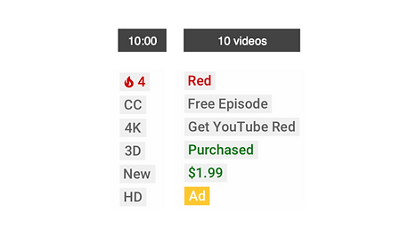
In 2015, YouTube was pursuing rapid growth and expansion. However, the company lacked a consistent brand identity due to the fact that each organization was creating and using brand assets as needed without uniform guidelines. For example, although there was a color palette, random colors unrelated to YouTube's identity were being used, and the shape and typography of the logo were also of various kinds.
In order to address this issue, YouTube decided to build a solid brand system. To do this, YouTube looked back at its essence and developed a brand system that embodies YouTube's values and philosophy.
2015 YouTube Logo Usages

2015 YouTube Color Palette
Design Principles
We have established four principles to help understand the values YouTube aspires to, starting from within the organization. And based on those principles, we've created a statement that concisely explains the fundamental value as
"YouTube is a place where people connect and express their story."

Logo Refresh

The existing logo was already highly recognizable and had become familiar to users. Deciding to completely overhaul such a symbol without a change in YouTube's business direction or philosophy would not have served our purpose and could potentially confuse users. Therefore, we opted to upgrade the existing logo.

The original logo incubated the word "Tube" within a Tube(red lozenge-shaped form). We simplified its repeated use by separating the text and shape, and proceeded with an update to the typography.

Additionally, we inserted YouTube's other iconic symbol, the play button, into the separated lozenge. This allowed us to create a logo icon that could express YouTube's identity even in its simplest form.
The new symbol, with its shape, graphic elements, and color alone, was sufficient to represent YouTube. We use the icon itself as an app launcher.

Based on the new logo, we systematized the logotypes of various sub-brands within the YouTube ecosystem to design them with uniformity.
Through this design upgrade, we managed to retain familiarity while extending modernity and versatility. It also allowed us to ensure usability and visibility were enhanced.
YouTube Sans
When designing YouTube as a platform, we minimized visually stimulating elements that could interfere with the content, thereby enhancing the prominence of the content itself. As one method to quickly imprint the unique character of YouTube during external exposures, we created a special font.

The typeface was built off the diagonal grid of YouTube play icon, which influenced the angle cuts in the ascenders and arms, and the curves in the collars and shoulders.

YouTube Sans promotional video created by Andrew Lebov.
Color Palette
YouTube's primary brand color uses neutral colors to better highlight contents as a platform, and the use of a red accent color to emphasize the brand's identity with strictly designed discipline.
For areas where brand or marketing elements need to be highlighted, a secondary color palette was created to allow for greater freedom of expression.

Patterns
For events hosted by YouTube and when introducing the platform's diverse features, we created patterns suitable for each situation and mood to enhance the aesthetics, allowing promotional materials to convey energy, excitement, and capture attention with more expressive freedom.
The patterns are defined in three styles: geometric, organic, and texture. Depending on the background, a combination of various patterns can be used to create distinctive images.

Geometric

Organic

Texture
Examples of Brand Moments


YouTube Material
In 2015, YouTube conducted a study of its brand identity. The study found that the company lacked a consistent system within its organization. At the time, YouTube was focused on rapid experimentation, product feature expansion, and reducing user churn. As a result, brand voice and platform uniformity were limited.
Despite these challenges, YouTube was a high-growth company with strong momentum. The company saw the opportunity to take advantage of this growth and predicted significant expansion of both the organization and the platform.
The team aims to elevate our user experience to set it as the global standard of the industry. To address these challenges and opportunities, YouTube decided to build a consistent system for its brand and platform. To do this, the company created a new team that had not previously existed within YouTube. This team, Platform Design, developed YouTube's first brand system and user experience design system.
The UX design system defined the look and feel of YouTube's products and services. The system included guidelines for everything from user interface design to visual storytelling.
The brand and UX systems have been critical to YouTube's success. They have helped the company to build a strong brand identity, create a consistent user experience, and scale its organization and platform.
Status in 2015


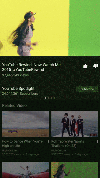
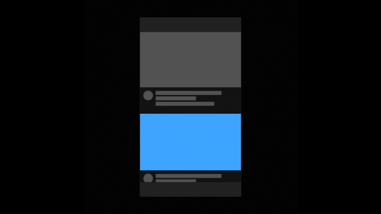
2014 - Watchpage
2014 - Channel


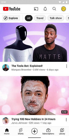
2015 - Watchpage
2015 - YouTube Music
In 2014, Google introduced its first-ever system design, the Material Design, and was in the process of updating the design across all Google products.
Native Google products such as Google Maps, Google Workspace, and Gmail, before digitalization, were tangible products drawn with ink on paper, which everyone could understand and physically interact with. Google’s Material design seamlessly integrates into such products as they transition into the digital realm.
YouTube, which joined Google in 2006, was also included in this transition, though it had not yet fully implemented Material Design.
Our team believes that for YouTube to actively expand and grow, it is essential to maintain trust in the platform and the quality of the product while moving forward with momentum. Therefore, we have decided to reevaluate and apply the Material system design to YouTube, ensuring it aligns with our commitment to quality and trust.
This approach will enable YouTube to enhance its user interface and user experience, reflecting the cohesive and intuitive design language that Google’s Material System offers.
Finding YouTube's Material
Since YouTube was acquired by Google in 2006, it is fundamentally different from Google's native products. Google's Material Design, developed with the native products in mind, adopted a design methodology that digitized the properties of paper and ink.

Material Design 1 (2015)
Light Study
However, the main content served by YouTube is video, which doesn’t fit naturally when applying Google's design principles, which were heavily based on paper and ink.
"What makes up YouTube's main content,
video, as paper and ink do?"
Posing this simple question led us to a straightforward answer.
"Light."
Once we defined light as our material, we began to explore it. We repeatedly tested and studied its properties.
During our discussions about light, we encountered a problem. When we mentioned our material was light, everyone pictured a different form of light, making it too abstract a topic to explain according to our intentions. This led us to consider how we could make everyone understand light in the same way.
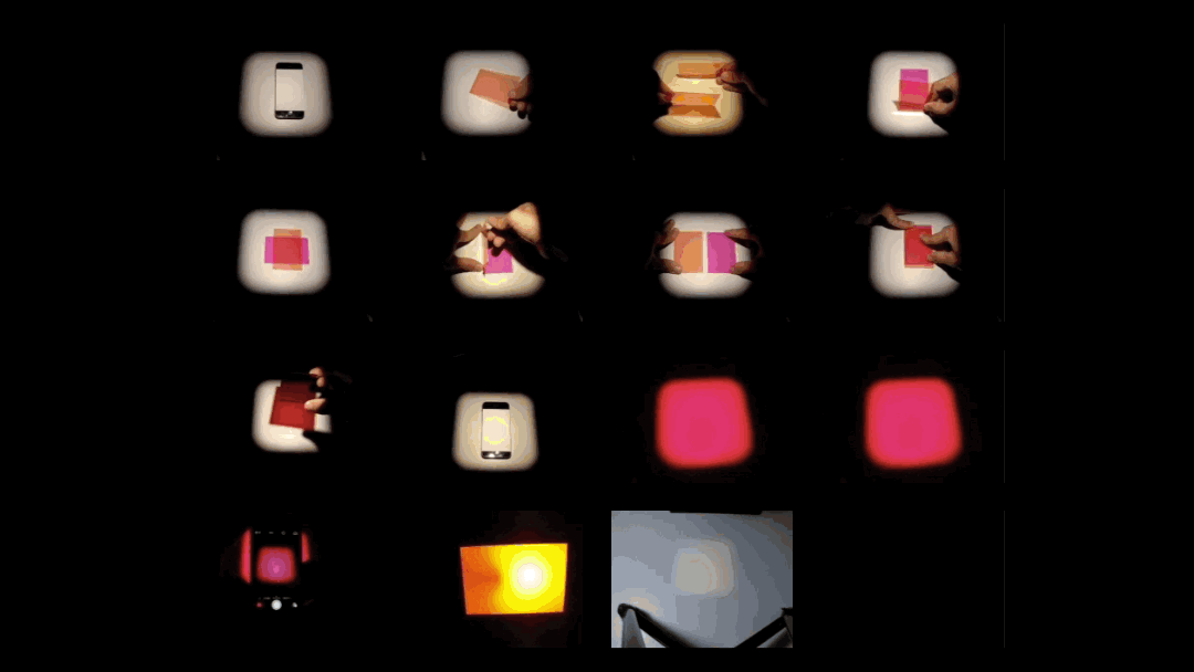
Our team realized that to universally communicate such an abstract material, we needed an object that could visually explain it. We defined and created an object that encapsulates light in an explainable form. The result was YouTube’s first material: a self-illuminating light sheet.
Self Illuminating Light Sheet (SILS)
Self Illuminating Light Sheet Basic Properties
-
Responds to interaction
-
Freely manipulated
-
Thickness of 1dp
-
control over the intensity of emission
-
Varying degrees of transparency
-
Can be layered
-
It creates shadows in limited environments

SILS is a virtual object that self-emits light, embodying the properties of light itself. It began with the hypothesis that light can be controlled by humans, and when transformed digitally, we applied the most fundamental properties necessary to the object.
Using the properties of SILS, we created an environment that could be applied to product design, explaining it in a way that colleagues within the organization could uniformly understand.


SILS can be layered and its intensity can be adjusted.
SILS can overlap within the same layer and its color can be changed.


Using the intensity level, areas outside the highlighted region can be dimmed, and multiple intensity levels can exist within the same layer.
Within a variety of layer hierarchies, surfaces can be created and removed.
Material Foundation
Material Foundation meant to ground our design language as well as our process for evaluating how it is used and how it can evolve.
The environment of YouTube Material is rooted in the Material system, but adapted to embody the liveliness and fluidity native to our content.
UX Design Principle
When multiple colleagues are creating different areas, guidelines are needed to align subjective opinions. Therefore, just as when building a brand, we have established four fundamental principles that are essential to follow when doing UX design.

UX Principle 01
Content First
"Let it shine"
We respect users’ ability to find content and experience it unaltered, as intended by creators. We don’t inhibit or distract users from understanding, choosing, and enjoying the content they care about.
UX Principle 02
Utility
"Clear and actionable"
We strive to improve the clarity and usability of our products. For our complex ecosystem to make sense, we keep ornamentation minimal, highlight interaction affordances, and maintain cohesion across platforms.

UX Principle 03
Expressive
"Unified, not uniform"
Through use of color, motion, and pattern, we provide an expressive spectrum of experience which allows for calm discovery surfaces, lively reward moments, and distinctive environments.

UX Principle 03
Responsive
"A native YouTube feels like home"
YouTube is everywhere. Regardless of a given device’s environment, size, or capability, our design adapts to feel native and considered. Likewise, our interface responds to shifts in the user’s focus, adapting contextually to reflect their choices.
Google Material vs YouTube Material
The environment of YouTube Material is rooted in the Material system, but adapted to embody the liveliness and fluidity native to our content. There are some key defining factors that distinguish YouTube Material.
Property | Google Material 1 | YouTube Material |
|---|---|---|
Surface Opacity | Opaque | Slightly Transparent |
Color System
YouTube’s color system mimics the qualities and behaviors of light. When light refracts, it breaks into a full color spectrum that can be applied to the UI. Our colors should always complement our content, strengthen our core user experiences, and reflect our brand.
Neutral Colors
The neutral palette is used in common surfaces. When considering the color system, we decided to start by eliminating the excessive and inconsistently used colors. While it might seem a bit dull, we focused on using only the most essential elements to create a more precise and concise experience, thereby removing elements that could interfere with the already colorful content, video.

The majority of YouTube’s UI is video. Neutral tones allow us to highlight and provide utility and hierarchy without competing. This empowers our content first UX principle.

Section colors are for large surface backgrounds. Component colors are for objects that are on top of surfaces. Products can choose which section colors they will use for feed backgrounds.

YouTube products can choose which section colors they will use for feed backgrounds.
Dark theme is a user’s choice. It is a low-light UI that helps improve the user's experience by reducing eye strain and adjusting brightness to accommodate dark environments that require dimmer screens.
Accent Colors
After setting up the basic color system, we began to apply meaningful colors to the UI as a method to quickly nudge towards a precise user experience and to convey our intentions more effectively. The accent palette provide ways to quickly distinguish certain parts of the UI. These colors are used for utilitarian actions, CTAs and badges. Enabling the clear and actionable goal of our utility UX principle. YouTube’s brand color, Pure Red, is used to emphasize the brand in key moments.


Color Constants & Semantic Name
Neutral Colors and Accent Colors serve as foundational colors within the system, used extensively across the product. To facilitate quick maintenance, management, and update across various situations and conditions, we have assigned color constants to all colors and released semantic names using these constants.
As a result, both light mode and dark mode can be freely applied, and updates to any color can be implemented seamlessly and simultaneously everywhere. Last but not least, it greatly enhances communication among collaborators.

Color Extraction
After establishing the foundation color system, we took a step further by developing a new color extraction algorithm that enables users to experience content in a more immersive way and adds a liveness to the platform. Using video, encapsulating all colors in the world, we created an infinite color palette that extends beyond system colors.

Color Extraction technology automatically extracts colors from all videos and images uploaded by creators, creating unique color palettes tailored to each piece of content. We developed proprietary software that automatically adjusts these colors to ensure both accessibility and visibility, making it easy for all colleagues to use.

Color Extraction Tool : Automatically extracts colors from an uploaded image
Color Extraction usage

Touch Feedback using colors extracted from images
Live Color Extraction
While developing our Color Extraction algorithm, we encountered a limitation. Our color extraction technology was based on extracting colors from still images, but YouTube's main content is video, a format where the image changes dozens of times per second. There was a significant risk that colors extracted from a single image might not blend well with the rapidly changing images in a video. Therefore, we also developed a Live Color Extraction algorithm that can extract colors in real-time to match with video content.

Live Color Extraction algorithm concept
Live Color Extraction concept prototype
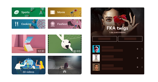
Content Objects

As one of our UX principles is Content First we have created a flexible but coherent system for categorizing the shape and embellishments of content objects, both current and future. This system enables users to consistently predict what will happen before they interact with any content.
Our objects are informed by Real-world inspirations, or any current objects it might inherit properties from as well as the nature of the destination that the object will lead the user to.
Intuitive Shapes

Fixed vs Dynamic Destinations
Each object’s shape is initially informed by the content it represents. We telegraph the destination behind a content object by using squared or rounded shapes. Fixed, static, unchanging destinations are represented by squared objects, while dynamic, living, novel destinations get rounded.

Embellished
Objects can be embellished to reveal helpful information about the underlying content and assist with differentiating similar objects from one another.

Dynamic Example : Game
The design is inspired by the standard 5:7 aspect ratio of physical game box art, creating dynamic game pages that are continually updated with fresh content from a variety of creators.
Metadata
In order to avoid confusion, non-actionable adornments that visually resemble buttons should utilize sharp corners with no rounding.

The cohesive content object system accommodating and signaling to our users all the different content types our platform has to offer.
Buttons

Buttons perform an action upon interaction. Each is bound to a surface, and none represent content.
Command Buttons perform simple actions and typically advance the user to a different surface.
Modifier Buttons adjust content or behavior on the current surface.

Motion & Interaction
YouTube Motion guides a user’s focus, hints at hierarchy, and can add a dash of personality, liveliness, and delight. Use Motion Primarily to draw attention, reduce perceived latency, prevent ambiguous moments, and reinforce relationships between elements during interactions and transitions.
Be informative
Use motion to increase a user’s understanding of the product by demonstrating hierarchical and spatial relationships between elements. Motion can also build a user’s proficiency with the interface by teaching available interactions.
Create delight
We employ a range of motion techniques to delight (and sometimes surprise) users. Transform elements smoothly, add charm to special actions, and celebrate the big moments in a journey
Be respectful
Treat user attention as a limited resource by adding value, being mindful of the moment, and not distracting from the intent of the message. Motion that provides feedback should be immediate, and transitions should help the user to understand the intended behavior.
Motion Design Principle
We have established principles that must be considered when creating motion and interaction. While movement serves various functions, it inherently contains emotional engagement, which is difficult to capture with simple foundations alone. Therefore, we needed strict rules to prevent it from being crafted based solely on subjective feelings. The principles of motion design were designed to express the properties of light.
Motion Principle 01
Energetic Initiation
Animate initial movement of attributes or assets with intense energy, visualized in colors and velocity.

Motion Principle 02
Gentle Resolution
In contrast with a transition initiation, an animated asset should land gently at its destination. This will signal users where the interaction has happened.

Motion Principle 03
Clear Direction
When repositioning a component, show a hint of its direction. It should disappear from its original position, and reappear gently with only a hint of where it cam from.

Motion Principle 03
Static Interval
When we create a sequential or loop able animation, it should have a quiet moment of rest to gather energy for the next movement.
Motion Curves
Based on the motion principle, we created the YouTube Motion Curve, which represents the speed of light, and the Mood Curve, which captures the subtlety of light. These ensure that everyone can achieve the same feeling of movement, and contrasting motion curves can be appropriately utilized according to the situation.

YouTube Motion Curve
YouTube Motion Curve is our default system motion curve. It applies to all system animations, in most attributes, including position, scale, and opacity.

Mood Curve
YouTube Mood Curve is a refining motion curve used to evoke our unique patina in our products.
Interactions
When users interact with YouTube, we have crafted two types of feedback that depict the reaction of light. This enhances both the accessibility, by indicating whether the system has accurately recognized the user's actions, and the liveness of the product experience.
Touch Feedback
Touch Feedback is a visual style applied to the background layer of a component to confirm the system has received the user’s input.
Responses
Add a unique identity and experience to YouTube products by applying visually rich attributes to shapes and typography.
Transitions
We analyzed patterns that are repeatedly used in the YouTube environment and developed two transition models. Using the YouTube Motion Curve, we depicted the movement of light and designed transitions between multiple panels to move in a unified manner according to their structure, ensuring complexity is managed effectively.
Page Transition
Page Transition takes the user from one environment to another.
Insert Transition
Insert Transition lays a new surface over the current page. They can be initiated by user input and are often used for system messaging.
Animations

Strictly defined rules were optimized for the essential movements and reactions on YouTube, but we added more dynamic animations for special moments and situations to enhance the user experience.
The animations aim to convey that a user’s action is not just a simple touch, but holds significant meaning. Due to the limited spaces, we avoided overly complex or excessive expressions, choosing instead short and simple animations that increase the satisfaction of the moment.
Like button animation example

Collection of motion and interaction examples
Page Transition

Insert Transition

Miniplayer behavior

Watch to Shorts
YouTube Standards
*Due to company regulations regarding sensitive information, I am not unable to display detailed information.
YouTube Standards demonstrates how to properly design components for YouTube products and marketing pieces, and documents the approved YT specific evolutions of Material design that have come up over the years. By creating a fully contextualized source of truth for entire YouTube branded products, we aim to correct the discontinuity that exists across the ecosystem and to speed our ability to create scalable UX solutions across the platform that reflect our third-party status within Material 2.0.

YouTube Standards is an internal website accessible to all employees, where they can quickly and accurately obtain the information they need. YouTube Standards thoroughly covers a total of 52 topics on individual pages and is continuously being expanded and updated.
Modernization
After establishing a solid foundation with YouTube’s unique design system, YouTube Material, we took a step back to reflect on our product and asked ourselves,
"Does YouTube look modern?"
It doesn't take a long time to answer the question.
"Nope."
Over the past few years, numerous competitors have emerged, equipped with new technologies and designs. There was much to learn from them, and we needed to consider strategies to ensure a more definite competitive edge.
We have previously built a system design aimed at providing accurate and convenient services, and in the process, we have intentionally limited the exposure of YouTube's identity. We believe it is now the right time to infuse a more fun and enjoyable voice into this neutral platform. With this in mind, we have initiated a modernizing project.
Therefore, we revisited the various ideas we had tested while creating YouTube Material, updated them to align with current trends, and devised a plan to make YouTube appear younger, more modern, and more attractive.
Shapes
We first reviewed the shape. We evolved the UI from Google Material’s flat design to a trendy morphism style, designing it to provide a more user-friendly and modern sense of space.

Example of updating all images and thumbnails with rounded corners.

We have uniformly updated the designs across all platforms : Tablet

Example of Living Room update

Example of updating all components with rounded corners.

Example of Desktop update

Example of TV update
Colors
We decided to increase the overall color contrast. Previously, our color choices focused heavily on functionality and accessibility, limiting our ability to appeal attractively to users. We have made the colors more distinct and updated the previously vibrant palette to a more modern look, allowing content to stand out more. Additionally, we designed the light and dark themes to emphasize aesthetic qualities while enhancing accessibility.

Example of increased contrast

Example of Light Theme product UI

Example of monochromatic tools

Example of Dark Theme product UI
Cinematic Experience

We wanted to advance beyond YouTube's basic concept of simply watching videos to provide a more cinematic environment. We simulated the effect of light reflecting off the screen in a dark room or theater, giving viewers a dimensional feeling of being engaged with the digital space.
Using our previously developed color extraction technology, we directly extracted colors from the content to create natural reflections and diffusion of light. This enhancement not only improved the aesthetic appeal but also made the fundamental experience of choosing and watching videos more immersive.

Comparison of YouTube Music Album

Examples of Cinematic UI
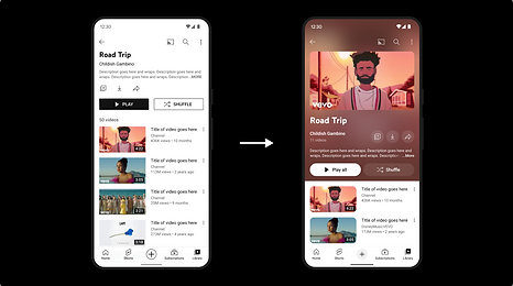
Comparison of Playlist

Examples of Cinematic UI
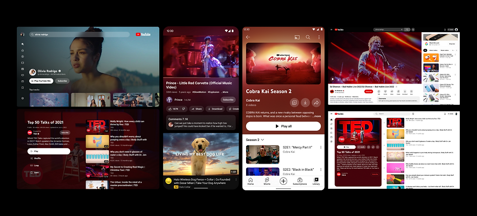
Examples of Cinematic UI
The Modernization Project is just the beginning of the evolution of YouTube Material. We've developed a process to ensure that both major and minor updates are rapidly and consistently implemented across the system, each uniquely crafted every year.
Throughout these projects, I have taken roles both as a lead and as an individual contributor, learning valuable lessons and experiencing both failures and successes. This journey has shown our team how to effectively navigate and steer the large enterprise that is YouTube.
Over the last eight years, we have significantly reshaped YouTube's design process and language. Most importantly, we have dramatically enhanced our standards in UX, Visual, and Motion design, setting new bars for excellence.